Downtown Oklahoma City wayfinding
May 2003
My final project as a visual communications student at the University of Oklahoma was creating a signage system for downtown Oklahoma City.
I was born and raised in Oklahoma City, and throughout my life I have thought to myself that it would be fantastic if the greater metropolitan area would stand out from any other small city in the US. There have been a number of attempts in the past few years that show the quest of Oklahoma City leadership to bring tourists and citizens to the downtown labyrinth. This has been exemplified by the logo system established in the historic districts of downtown and the urban renewal of the downtown area, however, the plethora of one-way streets and important buildings being tucked away behind other structures in combination with the complete lack of a sign system creates a maze to anyone unfamiliar with the area, even those that have lived nearby for years.
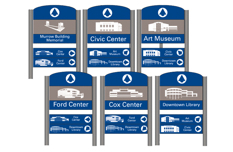
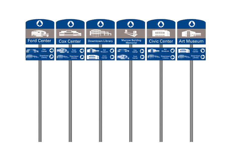
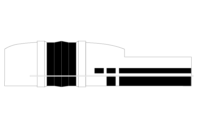
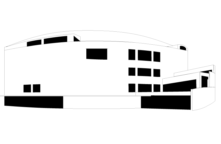
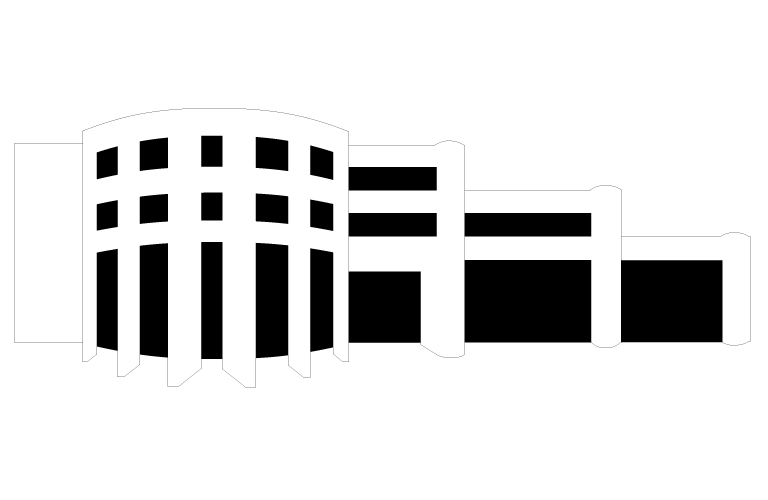
There are a great many areas of cultural interest packed into just a few blocks in downtown Oklahoma City, and because of this I was forced to narrow the vision down into just a few. I initially trimmed away attractions outside of Downtown proper, and in the end I chose six attractions: The Donald W. Reynolds Visual Art Center, The Ford Center, The Cox Communications Convention Center, The Civic Center Music Hall, The Alfred P. Murrow Federal Building Memorial, and the Downtown Library. So, having chosen these attractions, I then needed to know exactly what these buildings looked like, what they contained, and what their purpose is. So, my next step was to take a stroll through downtown Oklahoma City to find the buildings. I wandered with a friend and a camera and shot images of each of these landmarks to make use of pictographic imagery for the signs that I intended to create, and I scoured the internet to find the answers to the other aspects of my initial questions.
Having the first step of my research completed, I next came to the point of the project that would be the longest and most arduous.
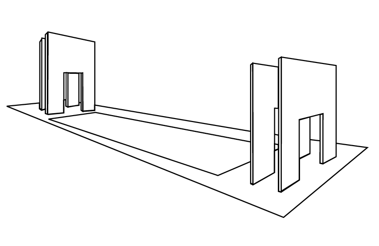
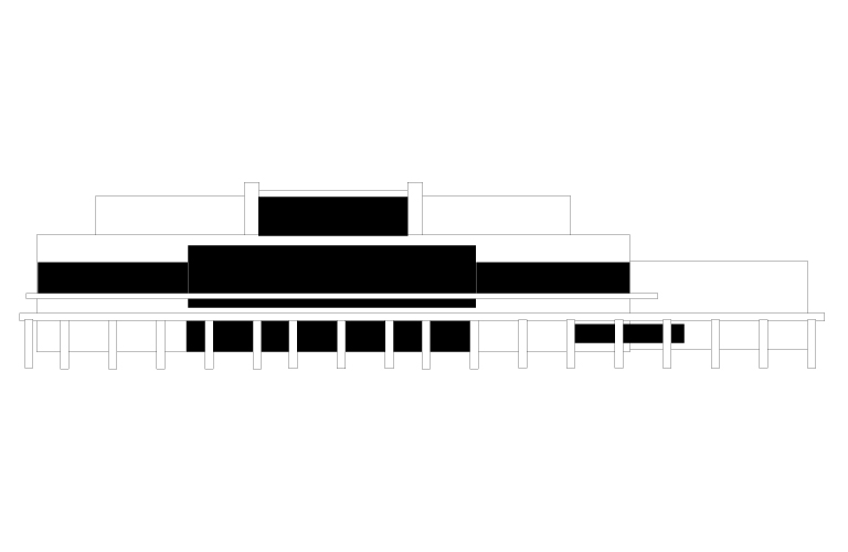
Initially the pictograms were very literal translations of each of the six buildings. Taking the first translations I began to simplify each and hack them to pieces to find a language that could be implemented between all six pictograms. Because of the structure of each of the buildings it seemed obvious to create an asymmetrical aspect through the structure to create a sense of visual excitement. I simplified each of the pictograms to the most basic recognizable forms and then stepped backwards through my progress.
Finding the most recognizable of each of the pictograms, I began to refine the depictions to keep a congruent language from one pictogram to the next. After finalizing the images, I found the next conundrum of my project: How would these pictograms be implemented into a signage system?
Beginning with the strongly mandated regulatory signs, I found the rules entirely too confining. However, a few points I felt should be carried over to the system I would create. Coloration, for example, I thought to be very important for the system, and regulatory signs pointed me to decision I was pleased with. The blue found on these six, for example, was chosen to be the same blue used in regulatory signs of entertainment sites.
The arrow was meant to be representative of an arrowhead, though quite stylized obviously. This I felt was important idea to implement to give a sense of native culture and ideals of the state.
Finally there are two types of signs, one meant for pedestrian traffic and one for motor traffic. The shorter of the two could easily be implemented into larger directories to offer more information to visitors.