
Self Promotion
June 2003
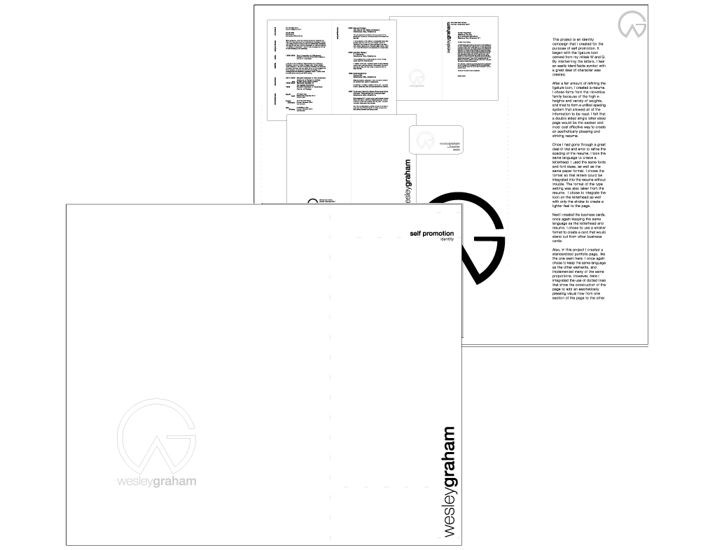
This project is an identity campaign that I created for the purpose of self promotion. It began with the ligature icon derived from my initials W and G. By intertwining the letters, I feel an easily identifiable symbol with a great deal of character was created.
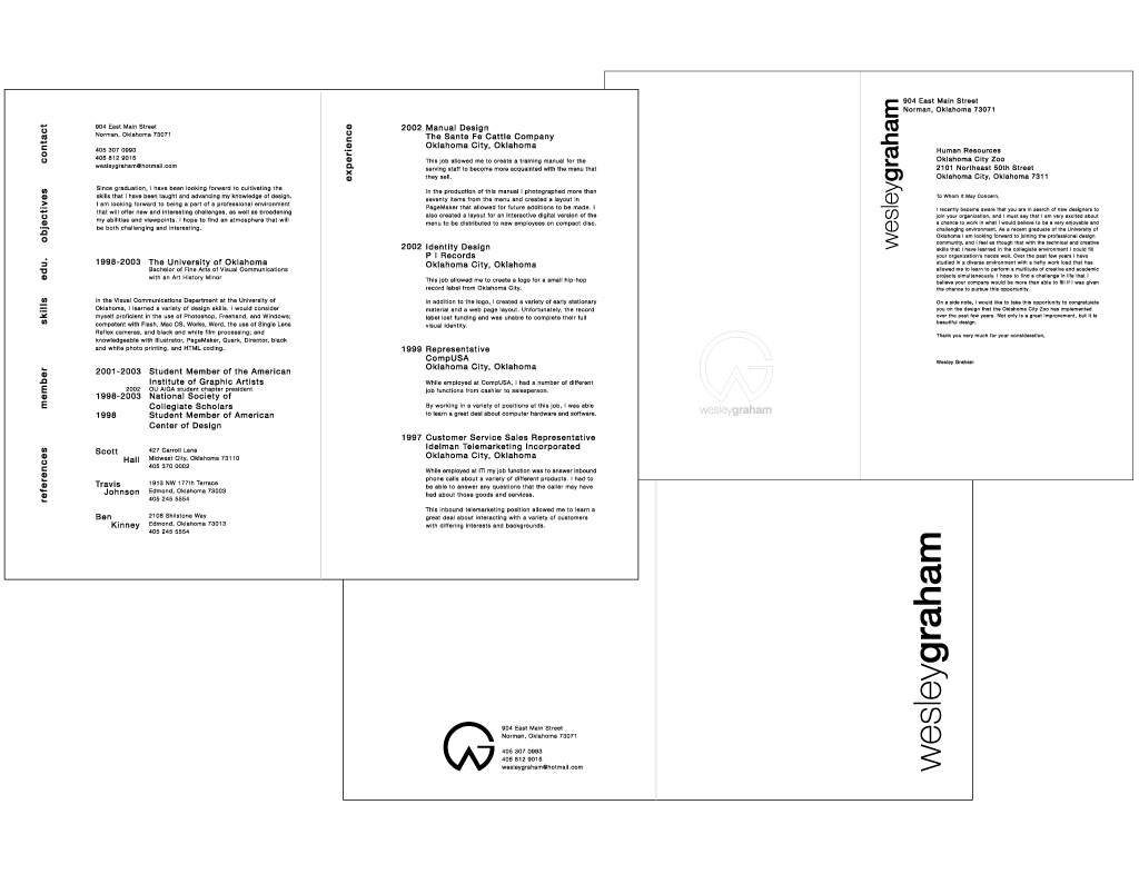
After a fair amount of refining the ligature icon, I created a resume. I chose fonts from the Helvetica family because of the high x-heights and variety of weights, and tried to form a unified spacing system that allowed all of the information to be read. I felt that a double sided single letter sized page would be the easiest and most cost effective way to create an aesthetically pleasing and striking resume. Once I had gone through a great deal of trial and error to refine the spacing of the resume, I took the same language to create a letterhead. I used the same fonts and font sizes, as well as the same paper format. I chose the format so that letters could be integrated into the resume without trouble. The format of the type setting was also taken from the resume. I chose to integrate the icon on the letterhead as well with only the stroke to create a lighter feel to the page.
Next I created the business cards, once again keeping the same language as the letterhead and resume. I chose to use a smaller format to create a card that would stand out from other business cards.
Also, in this project I created a standardized portfolio page, like the one seen here. I once again chose to keep the same language as the other elements, and implemented many of the same proportions. However, here I integrated the use of dotted lines that show the construction of the page to add an aesthetically pleasing visual flow from one section of the page to the other.