Forest Building Products Identity
August 2003
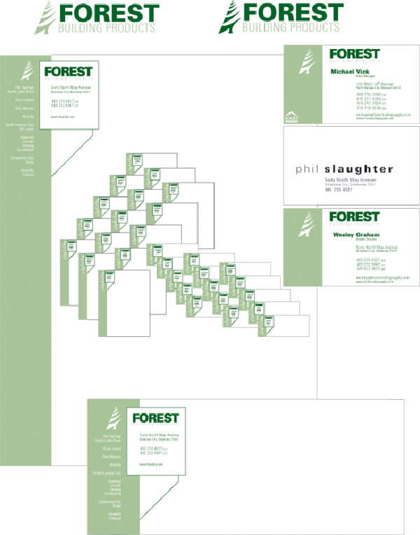
My first project after being hired by Forest Building Products, was to rebuild their Corporate Identity System, based on a logo that they had been leaning toward. I began by taking that logo, and changing the color a fair amount, to give a softer, more understated feel. With that I began to sketch business cards and letterhead. While in the initial phases of this project, I was also given the task of redesigning the company intranet pages and their internet pages. This, though at the time seeming otherwise, proved advantageous in keeping all aspects of the company identity within the same language.
After a good number of sketches, I settled on the large block on the left margin, to create a solid foundation for the design, which in turn emphasized the same idea about the company. On the letterhead, I added the branch location cities into this block, to not only make a more aesthetic look, but to be mildly reminiscent of the lines created by siding (the business that the company was in). Upon this I added a block to contain the branch location contact information. This I tied to the green swath with a 45° line, to be an anchor suggestive of building plans.
I felt that this design, though very understated, emphasized all of the qualities that the company was trying to establish. Before this redesign the company was using the same system that they had adopted in the 1970s. With the new system, not only does the company have a solid identity, but that identity also accentuates all of the qualities, that the company was trying to illustrate.
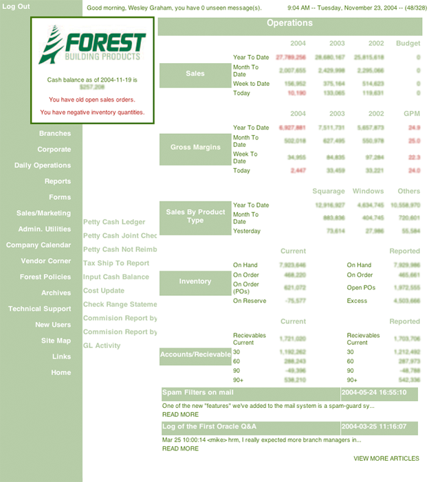
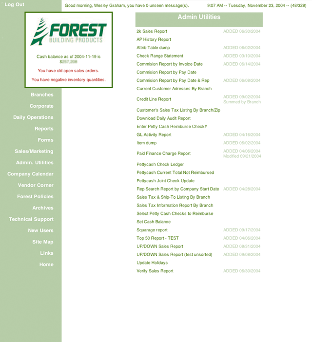
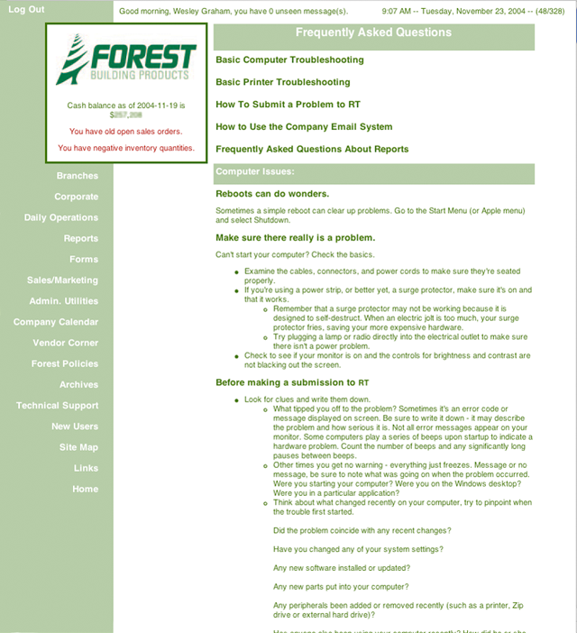
The second part of the corporate identity redesign project I had undertaken after being hired by Forest Building Products, was to redesign their Intranet pages, based on the identity system I had created. I began by gathering the roughly 300 pages of information from the origianl pages, and creating a heirarchy based on the importance of each page, and a small survey I had done of the different corporate and branch employees of what they used and wanted from the new pages. After that I built a template from the corporate identity as the map for the projects look. Because the pages, needed to contain a great deal of information, I designed the page using a javascript that would play with the visibility of layers to create a series of roll over menus to hide the dozens of required links. This also allowed me to have the links on each and every page, as opposed the previous versions that had links from only the main page.
After establishing the look that I wanted for the project, I began to poor over the HTML/PERL hybrid pages, and began to learn enough of the basics of PERL to manipulate the code for what the pages needed to do. Over the course of the next three months, I completely destroyed the outdated, incomplete, and in many cases broken pages, and rebuilt the Intranet to be a fully functioning tool for the company.
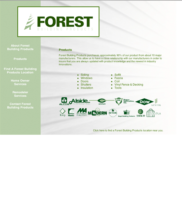
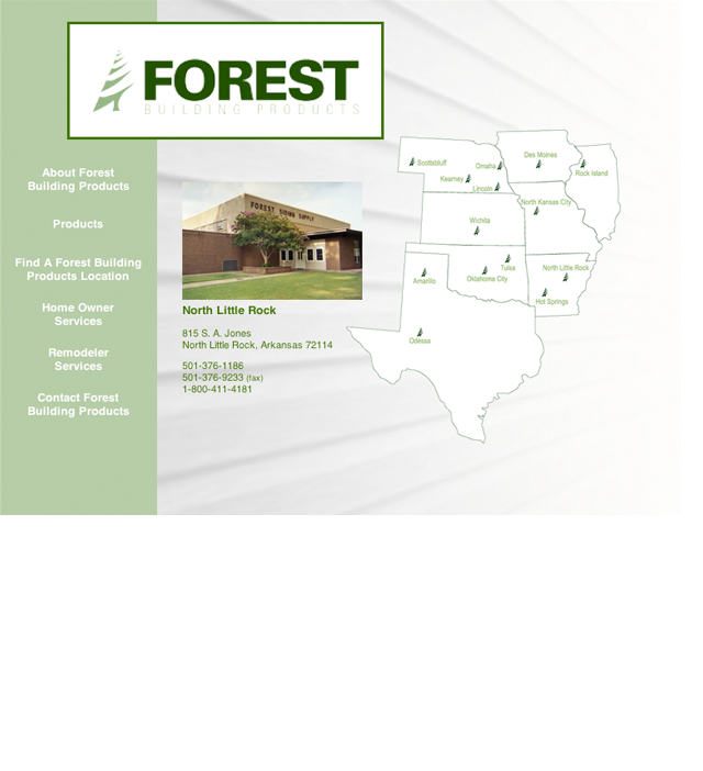
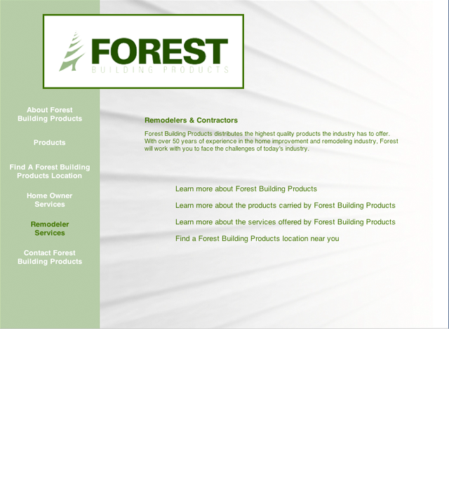
The third leg of the corporate identity redesign project I had undertaken after being hired by Forest Building Products, was to redesign their Internet pages, based on the identity system I had created. I began by taking the information from the origianl pages, and creating a heirarchy based on the importance of each page. After that I built a template from the corporate identity as the map for the project.
Because the pages, did not need to contain a great deal of information, I designed the page using a javascript that would play with the visibility of layers rather than creating a number of pages that would have to reload the same images each and everytime a link was clicked. I chose to do this rather than an iframe system to keep the border that appears around an iframe when using Microsoft Internet Explorer on a PC platform. By using layer visiblity within the stylesheet, I was able to create a somewhat seemless appeal to the display of information.
By keeping the same language as the paper identity, I was able to keep the emphasis of the qualities that the company was trying to establish, while keeping a unified message from paper to digital literature. This emphasized a branding of the company that would be instantly recognizable, and would be much more timely than the design adopted in the 1970s.