The Fall Animation
Septemer 2002
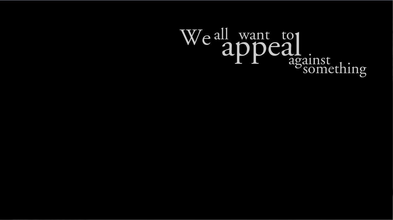
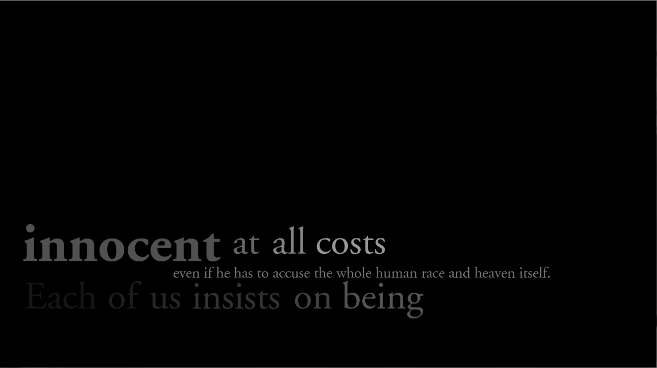
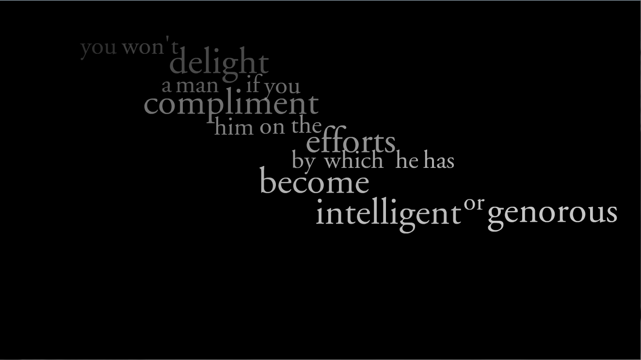
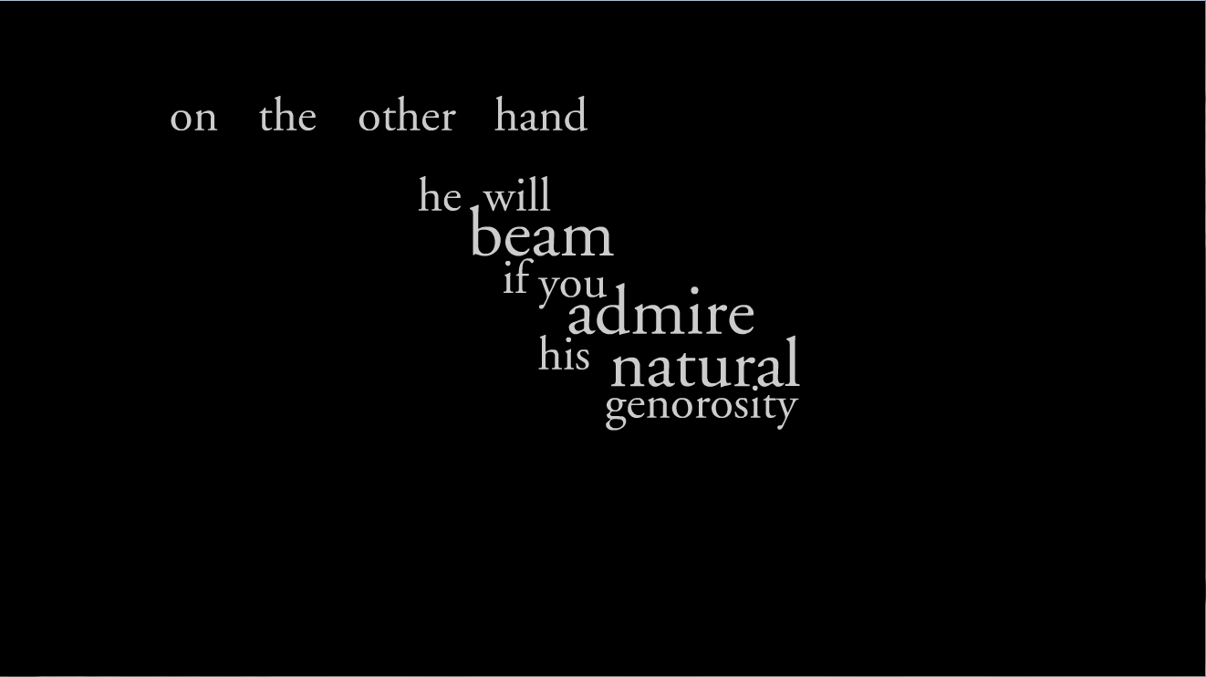
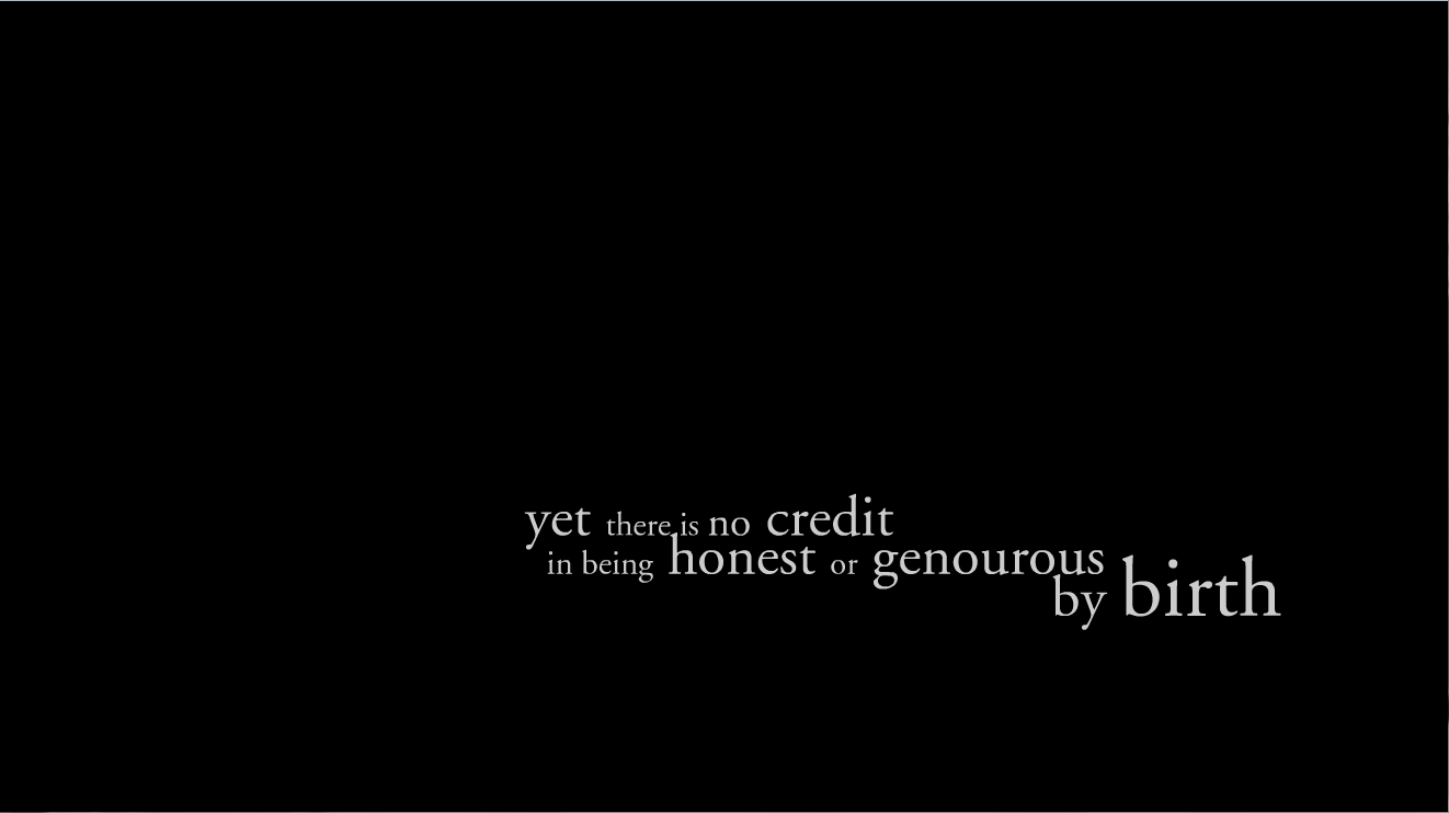
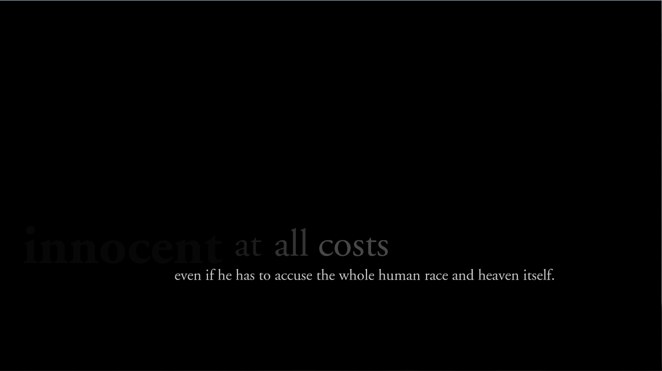
This was a flash animation project to illustrate a poem or quote. I chose a quote from Albert Camus’ The Fall, because I greatly admire his ideas, and I happened to be reading The Fall when I was given the assignment. I began the project as a study of type and its different integrations and flash implementations.
I chose to use fonts from the Garamond family, because I felt that the text identified strongly with a classical serif font. The serifs of Garamond also allowed for very interesting construction of word groupings.
This construction of various groupings of type moving into their positions is where I began the project. I mainly experimented with the integration of different words in differing sizes that would create an interesting form when integrated together. This interest was also given a more dynamic quality when the construction of the forms was animated
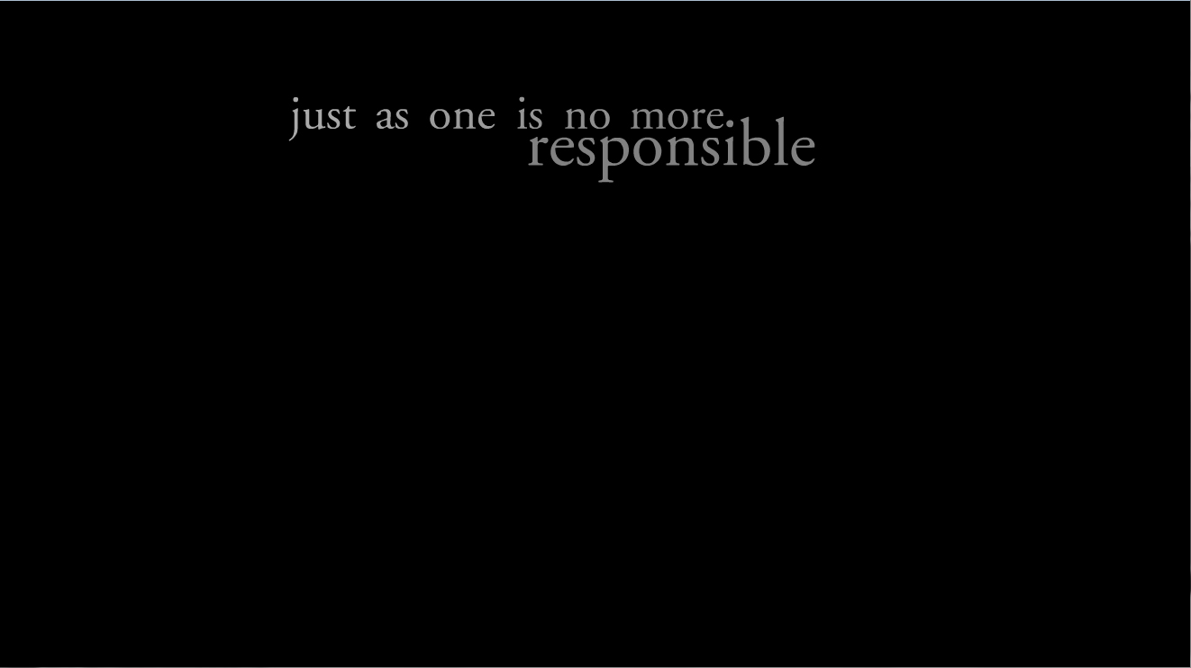
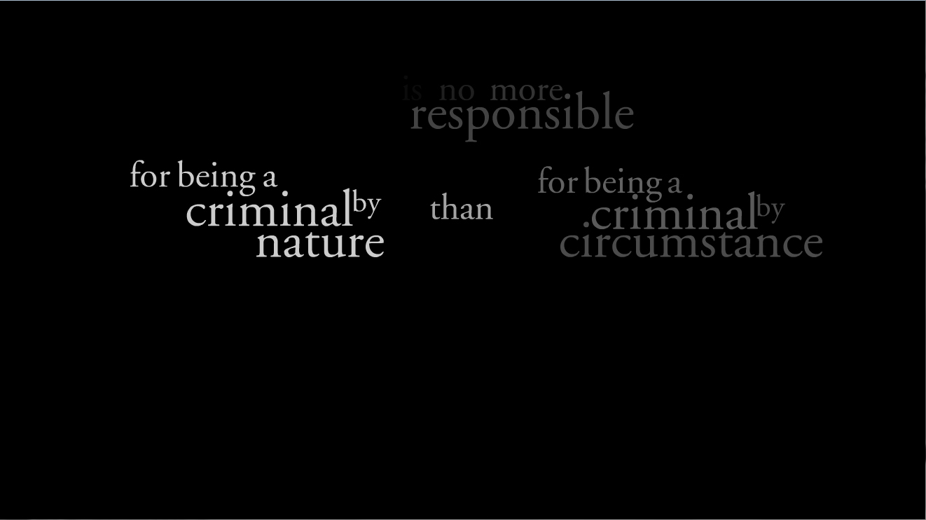
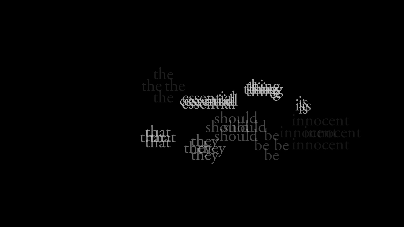
The latter phrases were exclusively typographic studies in flash. I created various implementations of animation that were quintessential of flash animation, such as ghost type. I felt that this project offered me a great opportunity to learn more about making type more dynamic.
The project quickly became a study in the ability of the eye to quickly view and comprehend moving type. I experimented mainly with the length of time needed for construction, readability, and deconstruction. I feel that I was able to capture the maximum amount of readability with the minimal amount of time each phrase remains on the screen. I feel that this is very important to the understanding of the dynamic qualities of moving text. The ability for the viewer to read text far out-weighs other qualities, but those attributes peak the viewer’s interest in the type.
All in all I feel that this was a very beneficial and successful project. I was able to further my knowledge of flash animation, as well as learn good lessons about the qualities of type